Hey there! So, you’ve finally finished building your SaaS and now you need a SaaS landing page to show it off. That’s great. You’re in the right place.
Maybe you’re wondering, “What should I put on my landing page?” or “How do I make sure people actually sign up when they visit?” Don’t worry, we’ve got you covered.
In this blog post, we’re going to look at lots of landing pages and figure out what makes them work so well. We’ll talk about:
1) What to put on your SaaS landing page
2) How to make it look good
3) Proven tactics to get more people to sign up
4) What other SaaS companies are doing that works
By the time you finish reading, you’ll have tons of ideas for your own landing page. You’ll know how to make one that really shows off your software and gets people excited to try it.
Ready to make an awesome landing page? Let’s dive in!
Table of Contents
Why do you need a landing page for your saas?
So first things first, what exactly is a SaaS landing page, and why is it important?
A SaaS landing page is a web page designed with a single focus: to convert visitors into leads or customers for your software product. Its primary job is to make visitors take a specific action: whether that’s signing up for a free trial, scheduling a demo, or making a purchase.
Why is a landing page crucial for your SaaS business?
1) First Impressions Matter: Your landing page is often the first interaction a potential customer has with your product. It’s your chance to make a strong first impression and clearly communicate your value proposition.
2) Focused Messaging: A landing page allows you to tailor your message to a specific audience or campaign, increasing the relevance of your content to the visitor.
3) Lead Generation: A well-designed landing page can be a powerful tool for capturing leads, allowing you to nurture potential customers even if they’re not ready to buy immediately.
4) Conversion Optimization: Landing pages are designed with conversion in mind, making them highly effective at turning visitors into customers.
Your SaaS landing page is where people go from hearing about your product to becoming leads or paying subscribers. So it’s a big deal to get it right if you want your saas to grow fast.
The Essentials of a SaaS Landing Page
Now that we understand the importance of a SaaS landing page, let’s break down the key elements that make up an effective one. Each of these components plays a crucial role in guiding your visitors towards taking action.
1. Headline: Your headline is the first thing visitors see, and it needs to grab their attention immediately. It should clearly communicate your value proposition in a concise, compelling way. Why? Because you only have a few seconds to capture a visitor’s interest before they decide to stay or leave.
2. Subheadline: This supports your main headline, providing a bit more detail about your offer or expanding on your value proposition. It’s your chance to elaborate on the hook you’ve set with your headline.
3. Hero Image or Video: A screenshot of your product or a demo can help people quickly see what your product is about and who it’s meant for.
4. Benefits and Features: Focus on the main benefits of your product and how it helps solve your customers’ problems. People want to know how it can make their lives easier & how it’s better than alternatives.
5. Social Proof: Include testimonials, customer logos, case studies, or user statistics. This builds trust and credibility, showing potential customers that others have found value in your product.
6. Call-to-Action (CTA): This is arguably the most important element on your page. Your CTA should be clear, prominent, and compelling, telling visitors exactly what action you want them to take. Whether it is to sign up, download or book a call.
7. Product Screenshots or Demo: Give visitors a glimpse of your product in action. This helps them visualize how they might use it and can reduce uncertainty about what they’re signing up for.
8. Pricing section: Be transparent about your pricing. If you offer multiple plans, clearly outline the differences between them. This helps set expectations and can filter out visitors who aren’t a good fit.
9. FAQ Section: Address common questions or objections potential customers might have. This can help overcome hesitations and move visitors closer to conversion.
10. Trust Signals: Include security badges, privacy policy links, and any relevant certifications. These reassure visitors that it’s safe to do business with you.
Each of these elements works together to create a cohesive, highly converting landing page that guides visitors towards taking action. The key is to ensure that every element on your page serves a purpose and contributes to your overall conversion goal.
26 Best SaaS Landing Page Examples & What You Can Steal from Them
We’ve curated best landing pages from SaaS that have grown exponentially in recent times, like Notion and Gumroad, as well as ones that are relatively new yet growing fast. By analyzing what worked for them, we can uncover valuable insights and strategies that you can apply to your own landing page.
Let’s dive into these examples and see what elements you can “steal” to boost your own SaaS landing page performance.
1. Tally.so
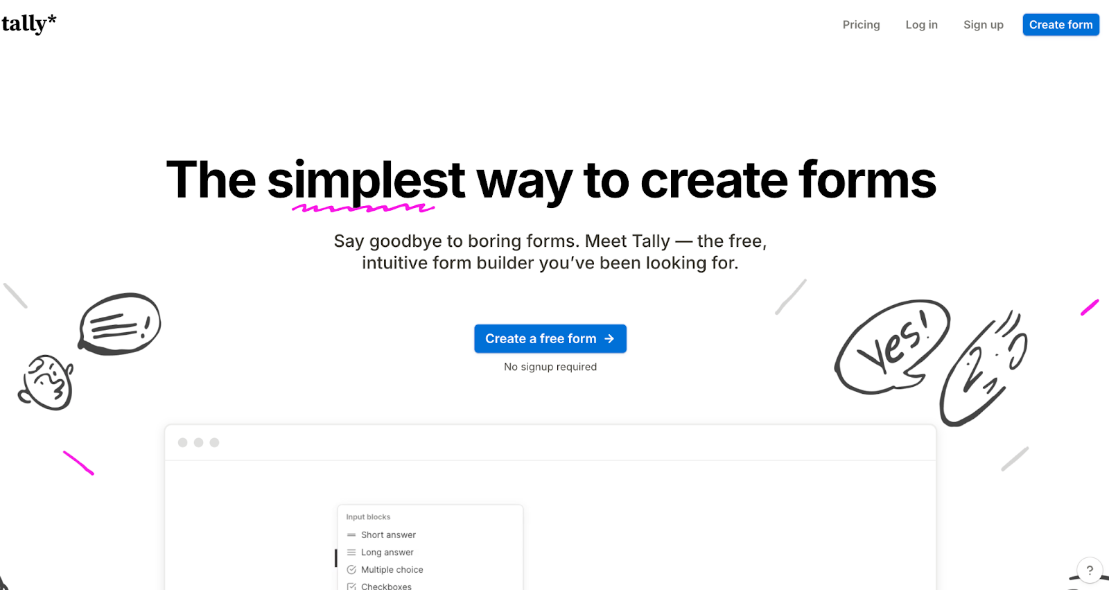
Tally.so is a user-friendly form builder that’s allows makers to create forms without writing a single line of code. Their landing page is an inspiration for effective communication and design.
What’s best in Tally landing page
- Interactive Product Demo: Tally shows rather than tells, allowing visitors to immediately understand the product’s functionality.
- Strategic Testimonial Placement: By adding testimonials after each section, Tally builds trust throughout the page.
- Clear Target Audience: They explicitly list their target users and use cases, helping visitors quickly determine if the product is right for them.
- Visual Emphasis: Important words are underlined to highlight key benefits and value propositions.
- Minimalist Design: The clean, Notion-style illustrations and simple design create a pleasant user experience.
2. Gumroad
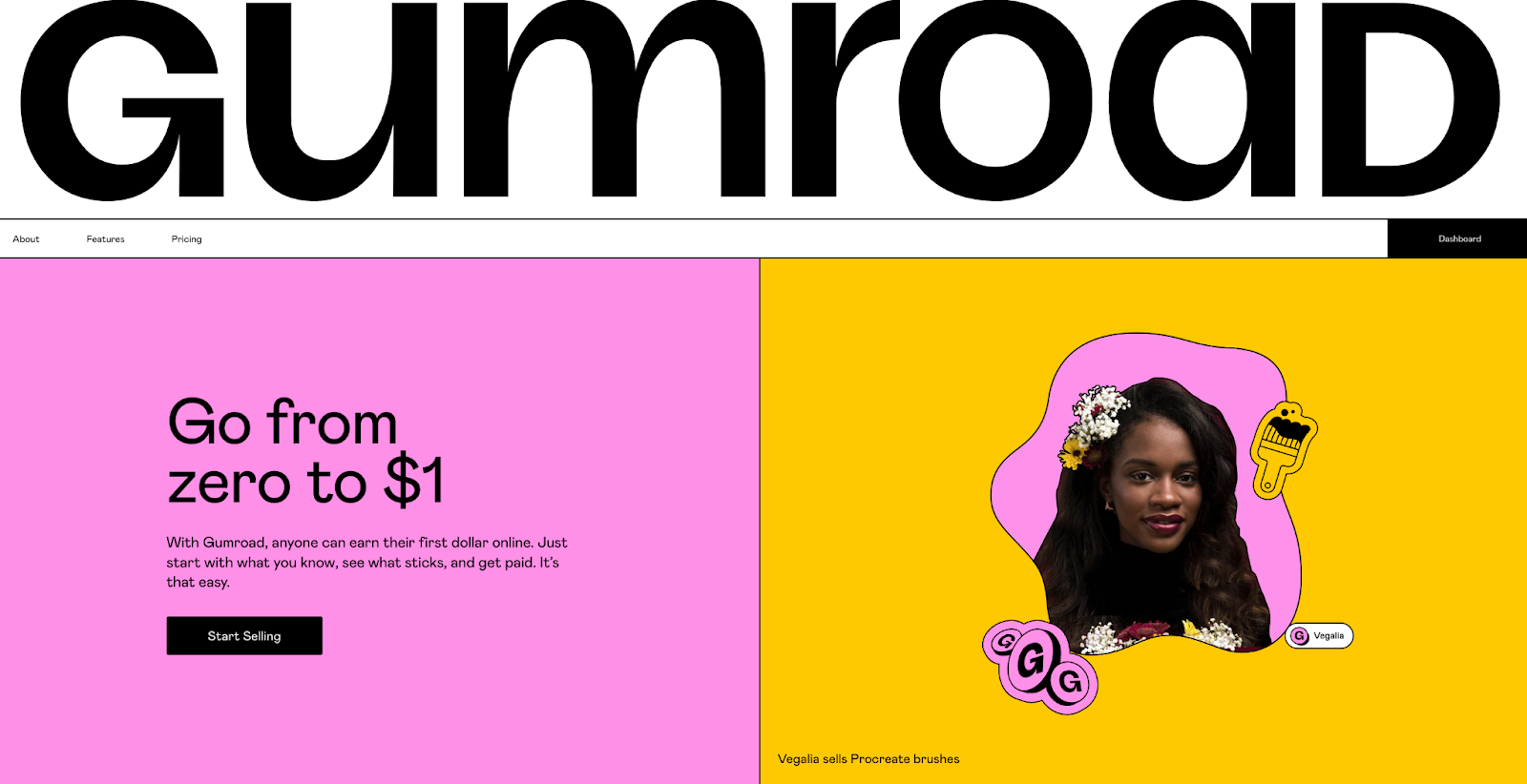
Gumroad is a popular platform for creators to sell digital products directly to their audience. Their landing page focuses on the creator’s journey and potential for success.
What’s best in Gumroad landing page
- Aspirational Storytelling: The page narrates the creator’s journey, highlighting the potential to “make your first $1.”
- Aspirational Testimonials: Gumroad features reviews from creators who’ve achieved significant success, inspiring visitors.
- Idea Generation: By showcasing top-selling ideas, Gumroad helps hesitant visitors overcome creative blocks.
- Revenue Transparency: Sharing the weekly revenue generated by creators on the platform creates a strong motivational factor.
3. ClickUp
ClickUp is a comprehensive project management tool that’s been rapidly gaining users. Their landing page effectively showcases their wide range of features without overwhelming visitors.
What’s best in Clickup landing page
- Interactive Feature Demo: ClickUp uses an interactive demo to showcase multiple features in a single, engaging section.
- Video Testimonials: Short, YouTube-style video testimonials build trust more effectively than text-based reviews.
- Low-Commitment CTA: The “Free forever, no credit card” message reduces barriers to entry for new users.
- Diverse Use Cases: By listing various business and team use cases, ClickUp helps visitors envision how the tool can fit their specific needs.
4. Beehiiv
Beehiiv is a newsletter platform that’s been becoming increasingly popular in the creator economy. Their landing page is bold, focused, and motivational.
What’s best in Beehiiv landing page
- Bold, Focused Copy: Beehiiv’s straightforward messaging centres around “Growth,” using bold font to emphasize this throughout the page.
- Action Over features: Instead of just listing its features, Beehiiv mentions the action the user will take using each feature (Publish, Write), and then plugs how its features help with that action.
- Social Proof from Big Names: By showcasing well-known brands and influencers using their platform, Beehiiv builds instant credibility.
- Revenue Motivation: Displaying creator revenue statistics motivates visitors to consider newsletter creation as a viable income stream.
5. Wix
Wix is one of the biggest website builders out there that started in 2006 and their landing page has evolved over the years. So if you want to design a landing page that’s backed by data, you should look into this.
What’s best in Wix landing page
- Horizontal Scroll Showcase: Wix uses a trendy horizontal scroll to display website templates, enhancing the browsing experience.
- Clear Action Plan: By outlining steps to start and grow a website, Wix demonstrates how their tools support the entire process.
- Emphasis on Customer Support: Wix highlights their robust customer support, addressing a key concern their target audience is most likely to have.
- Self-Referential Design: The “Created with Wix” banner builds trust and showcases the platform’s capabilities.
6. Crayo.ai
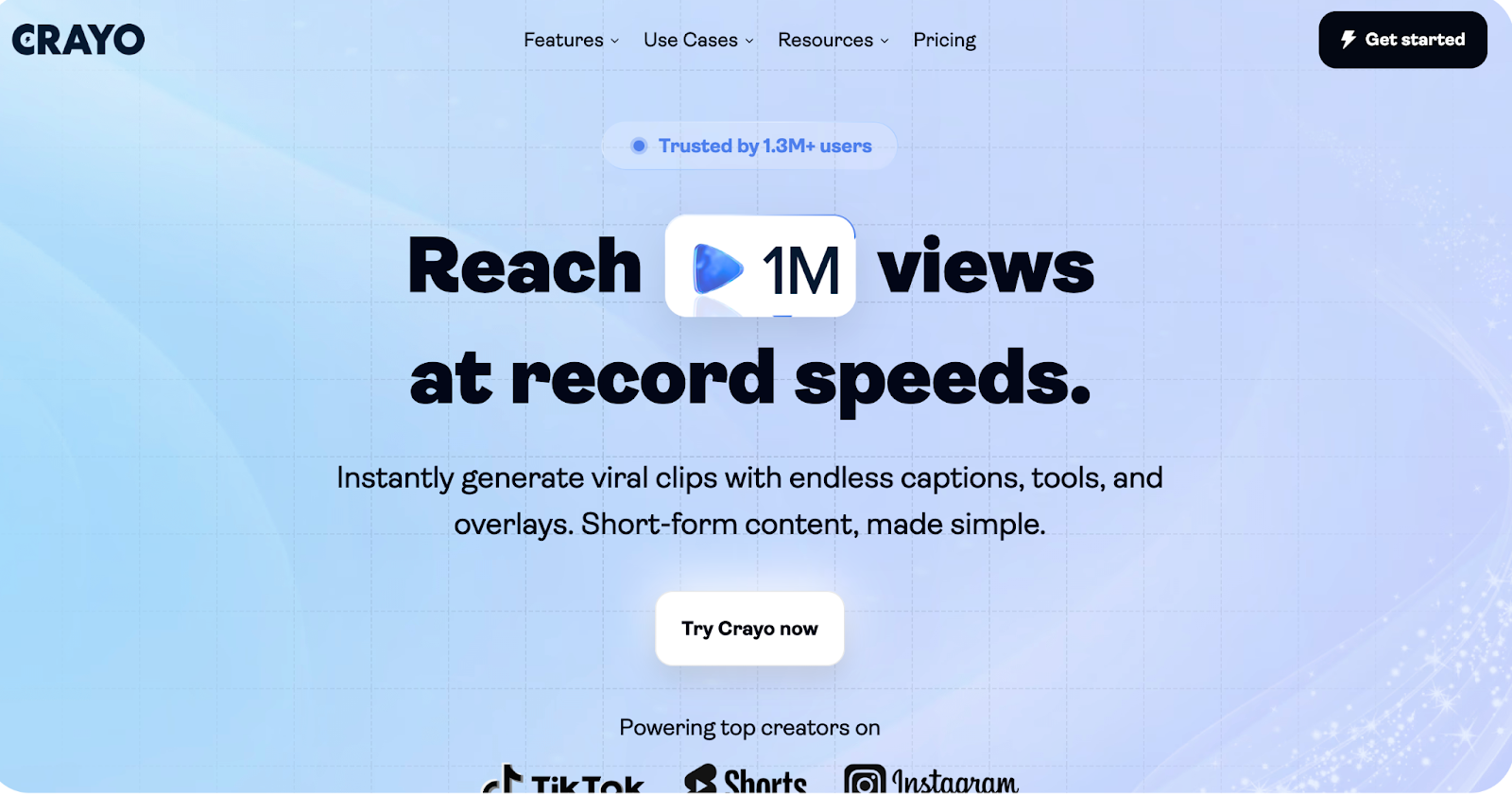
Crayo is an AI-powered tool for content creators to generate short-form videos with captions and overlays. Their landing page just has 4 sections but conveys their value in an effective way.
What’s best in Crayo landing page
- Bento Grid Layout: Crayo displays features in a well-designed bento grid, making the page concise and attention-grabbing.
- Consistent Value Proposition: The landing page maintains a singular focus on “Faster,” communicating this USP throughout all sections.
- Unique Design Approach: Unlike typical AI tool pages, Crayo uses light colors and simple backgrounds, creating a clean and attractive aesthetic.
7. Zapier
Zapier is a tool that helps automate tasks by connecting apps without coding. It’s a great example of how you can feature use cases of your SaaS on the landing page and encourage visitors to try it out.
What’s best in Zapier landing page
- Strategic Content Placement: Key selling points like “free forever” and competitive advantages are placed below the CTA, encouraging sign-ups.
- Template Showcase: By displaying workflow templates, Zapier demonstrates the tool’s immediate usability.
- Focus on AI Integration: Zapier showcases its AI chatbot for workflow creation, positioning itself as a leader in AI integration.
- Quantified Social Proof: The testimonial section highlights that 2.2 million businesses use Zapier, building significant credibility.
8. Audiopen
Audiopen is a fast-growing AI SaaS that converts voice notes into text that’s easy to read and share. This landing page is one of the shortest landing pages you’ll ever come across. And it’s a great place to draw inspiration, when you are new to the market & want to build trust.
What’s best in Zapier landing page
- Extensive Testimonial Wall: A three-scroll long testimonial wall with highlighted quotes emphasizes benefits and ease of use.
- Clear, Transitional Copy: The hero section uses a simple, straightforward copy that transitions to explain use cases.
- Interactive Demo: A sticky mic button allows visitors to instantly try the platform, setting clear expectations.
9. Storytale
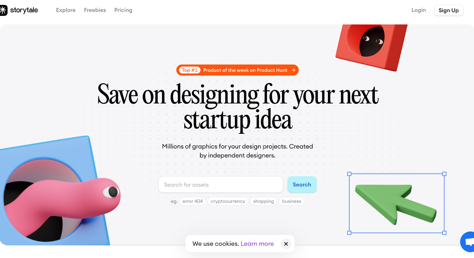
Storytale is a design asset platform that uses its landing page to showcase its vast library of assets and the community approval it has got.
What’s best in Storytale landing page
- Interactive Search Bar: The hero section includes a search bar that displays design assets, immediately demonstrating the platform’s range.
- Community Validation: Storytale prominently displays its Product Hunt badge, reviews, and launch details to build trust.
- Show Don’t tell: The page efficiently showcases various design assets that are part of its library using multiple sections.
- Effective Use of Bento Grids: Information is presented in bento grids, making it easy to consume without excessive scrolling.
10. Epidemic Sound
Epidemic Sound is a music licensing platform that offers creators royalty-free tracks for use in videos, podcasts, and other digital content. Their landing page creates an interactive experience for the target audience that would motivate them to explore further.
What’s best in Epidemic Sound landing page
- Real-Life Story Showcase: Short-form videos in a horizontal scroll format present engaging real-life stories.
- Scroll-Triggered Animations: On-the-go animations keep visitors engaged and curious as they scroll.
- Artist Highlight: Featuring popular artists builds credibility and showcases the quality of available content.
- Interactive Sounds: Play buttons on sound categories allow visitors to sample the music, providing a taste of the product.
11. Vesto
Vesto, is a financial platform that lets you connect and control all of your business bank accounts from one dashboard. Let’s see how its landing page builds trust and showcases its capabilities.
What’s best in Vesto landing page
- Clean, Trendy Design: The use of bento grids, horizontal scrolls, and a trust-inspiring color palette creates a pleasant user experience.
- Case Study Integration: Real-life case studies help visitors understand practical applications of the platform.
- Multi-Layered Social Proof: Vesto uses a trusted-by section, company logo animations, and prominent testimonials to build trust.
- Demo-Focused CTA: The primary CTA focuses on scheduling a free demo call, allowing for personalized pitching.
12. Dropbox
Dropbox, the well-known cloud storage and file hosting service, has a landing page that focuses on an engaging user experience and effectively communicating the platform’s core functionality.
What’s best in Dropbox landing page
- Engaging Scroll Experience: The page’s unique scrolling experience keeps visitors engaged and curious to see what comes next.
- Strategic Text Highlighting: Key USPs are highlighted in a plain text section, effectively communicating Dropbox’s capabilities.
- Show, Don’t Tell: Feature sections use minimal text but engaging designs to demonstrate the tool’s functionality.
- High-Profile Testimonials: Testimonials from big players in the industry help build trust.
13. Shopify
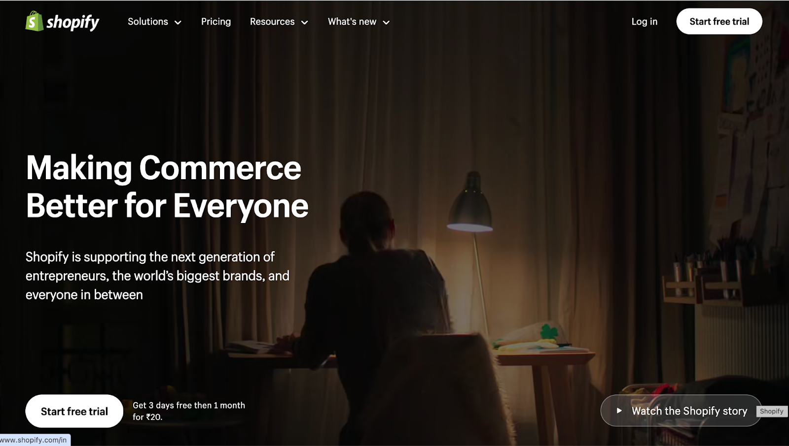
Shopify, the leading e-commerce platform, has designed and optimized its landing page to showcase its 2 core benefits: scale and support.
What’s best in Shopify landing page
- Impressive Statistics: Shopify shares data about businesses using the platform and their earnings to establish authority.
- Comprehensive Help Section: A detailed support section reassures visitors of ongoing assistance whenever they need help.
- Attention-Grabbing CTA: A moving horizontal strip CTA stands out from the design, encouraging clicks.
- Efficient Feature Presentation: Tabs and accordions are used to present numerous features without cluttering the page.
14. Compound Planning
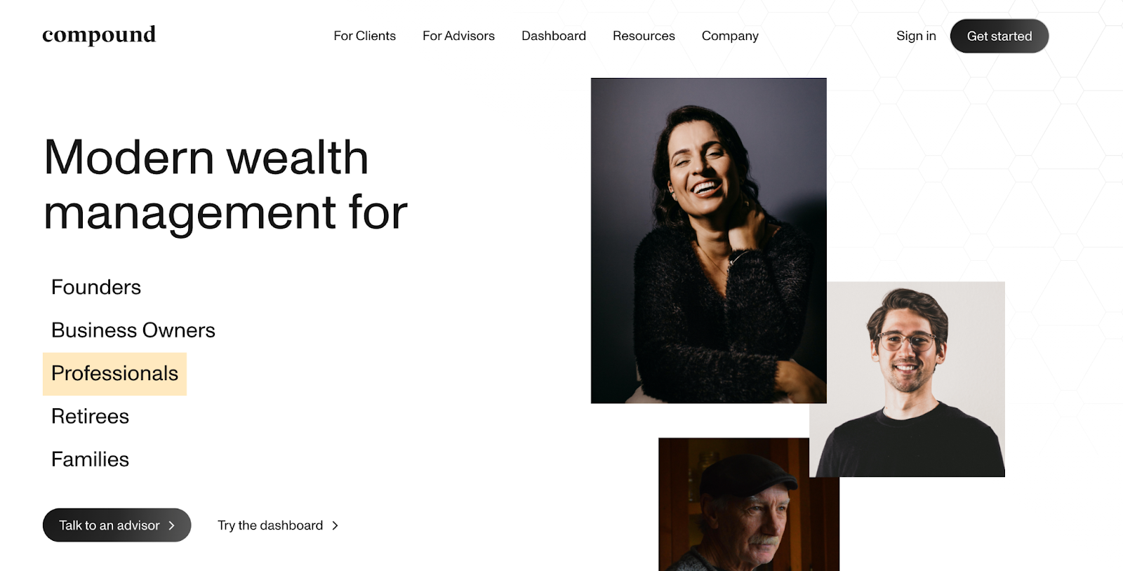
Compound Planning is a fintech SaaS, that offers personalized wealth management experience for entrepreneurs and professionals. Since customers are usually doubtful about new fintech companies, it effectively uses its landing page to build credibility and differentiate itself from competitors.
What’s best in Compound Planning landing page
- Animated Headline: An animated headline addresses various target audiences, increasing relatability.
- Authority Building: Numbers and partnered companies are prominently displayed to build credibility.
- Comparative Advantage: A comparison table with traditional firms clearly shows Compound Planning’s benefits and why customers should consider it over usual options .
- Elegant Design: The use of horizontal scrolls, minimal colors, and tabs creates a sophisticated user experience.
15. Superlist
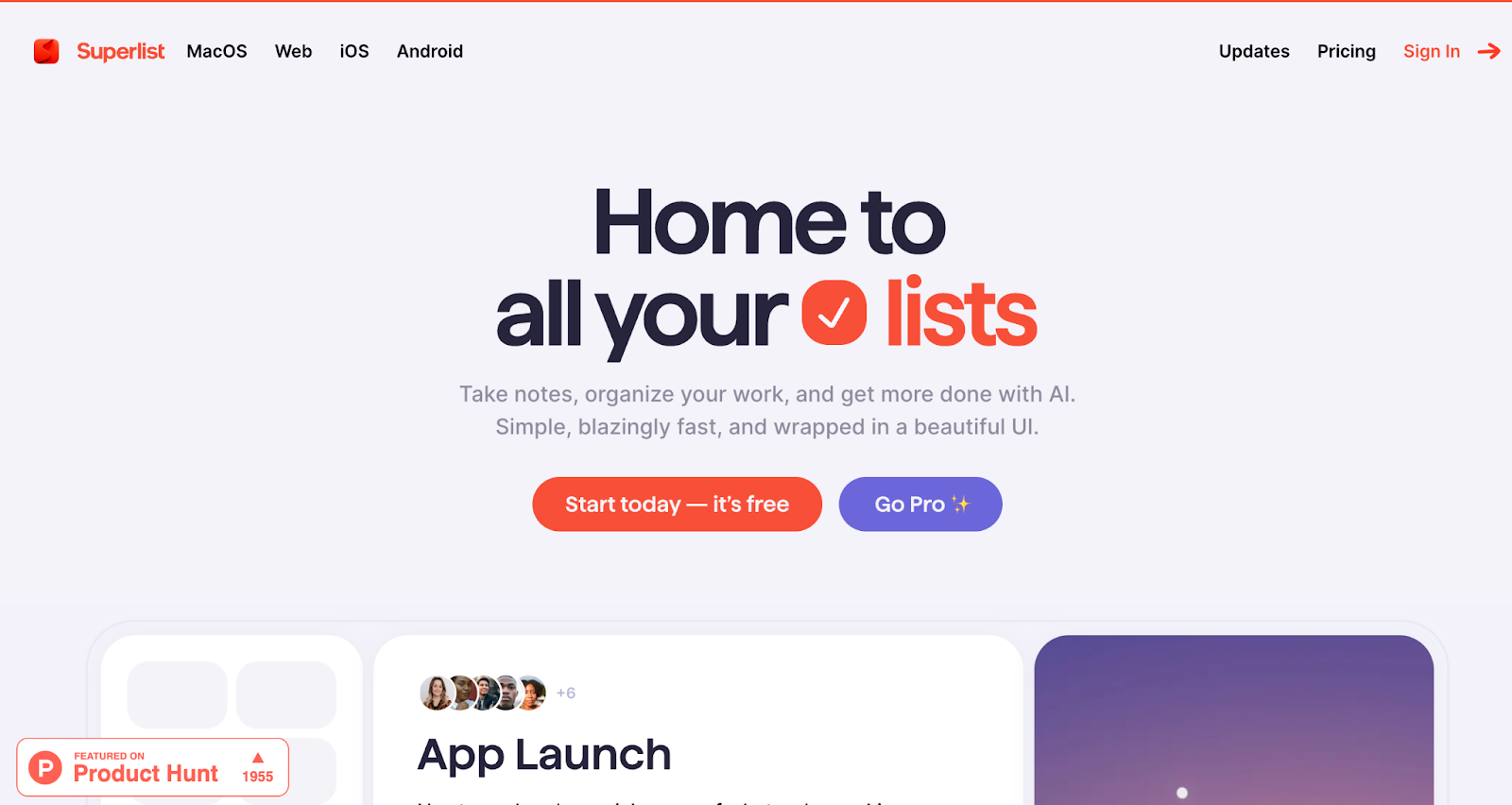
Superlist, is an AI Powered Todo list App, that was a big hit during its launch among the productivity audience. It showcases how animation and use of card design can make a landing page engaging to visitors.
What’s best in Superlist landing page
- Animated Feature Cards: Features are presented as animated cards that reveal as you scroll, creating an engaging experience.
- Standout CTA: A large CTA at the end of the page draws attention and encourages action.
- Community Validation: Product Hunt badges demonstrate community approval.
- High-Profile Reviews: Reviews from tech publications like TechCrunch build credibility.
16. Pally
Pally is a social media management platform for brands and content creators. This landing page stands out from the usual landing pages by being content-heavy and showcasing their work culture on the page to show what it stands for.
What’s best in Pally landing page
- Content-Rich Hero Section: Unlike typical landing pages, Pally’s hero section is packed with information, addressing pain points in the headings and explaining solutions in bulleted lists below.
- Humanizing Approach: A “We’re small business” section at the end of the page emphasizes their personal touch, making customers feel valued and reassured about support.
- Authentic Product Demo: Instead of polished screenshots, Pally displays a real user’s dashboard, building trust through authenticity.
- Customer-Centric Messaging: The testimonial section headline “We didn’t build this platform. You did” cleverly include customers in the product’s journey, fostering a sense of ownership and community.
17. Bio Link
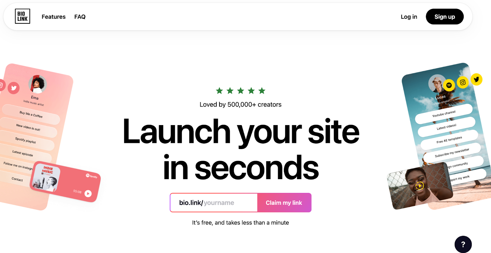
Bio Link is a popular tool for creating customized link landing pages, often used by social media influencers and content creators.
What’s best in Bio Link landing page
- Action-Oriented Hero CTA: Instead of a generic “Try for free” button, Bio Link uses a URL input with “Claim my link” text, creating urgency and encouraging immediate action.
- Visual Plan Comparison: Free and Pro plans are presented in visually distinct bento grids using light and dark modes, making it easy for visitors to compare options.
- Influencer Social Proof: The landing page showcases big-name influencers using their tool, instantly building credibility and appeal for their target audience.
18. PostHog
PostHog is an open-source product analytics platform that’s gaining popularity among developers. It is a collection of 8+ tools in one, featuring product analytics, session replay, feature flags, A/B testing, and more – all seamlessly integrated.
What’s best in PostHog landing page
- Reverse Psychology Section: A “You’ll hate PostHog” section presents features in a humorous, negative way, intriguing visitors and encouraging them to read more.
- Open-Source Credibility: PostHog displays their GitHub stars as a sticky element, building trust and showcasing their open-source nature.
- Development Transparency: By featuring their shipping calendar on the landing page, PostHog demonstrates their commitment to continuous improvement and feature development.
19. Webflow
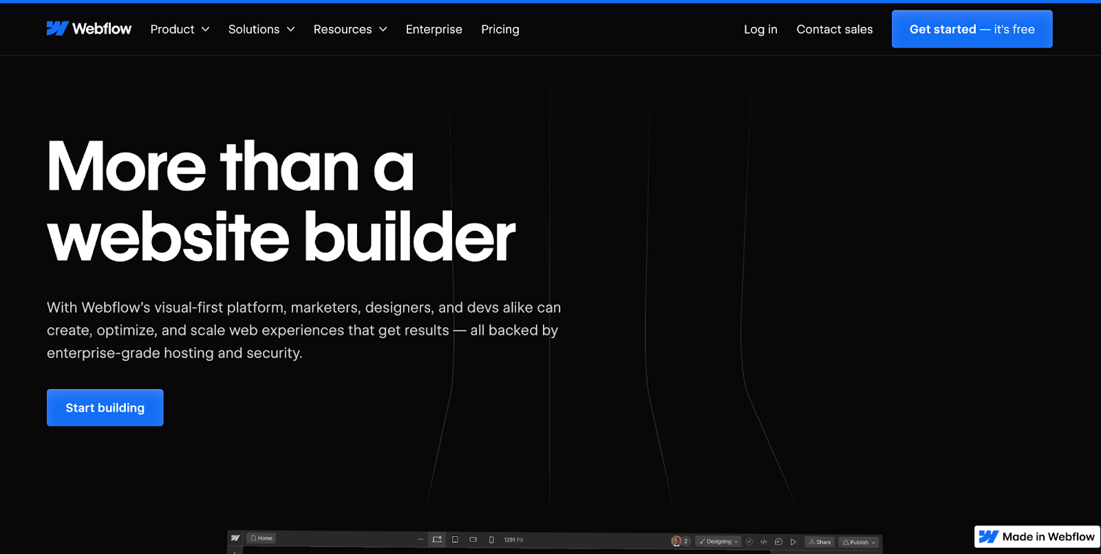
Webflow is a popular no-code website builder that empowers designers to create professional websites. Their landing page effectively showcases the platform’s capabilities and builds trust.
What’s best in Webflow landing page
- Dynamic Social Proof: A continuously moving horizontal bar displays logos of companies using Webflow, providing impressive social proof.
- Quantified Benefits: Webflow uses specific numbers to showcase how users have improved website speed, increased traffic, and accelerated development time.
- Product Showcase: The “Made in Webflow” section displays templates and live websites created with the platform, giving visitors a tangible idea of what they can achieve.
- Low-Risk CTA: The consistent use of “Get started for free” as a CTA throughout the page removes the cost barrier for trying the platform.
20. Headshot Pro
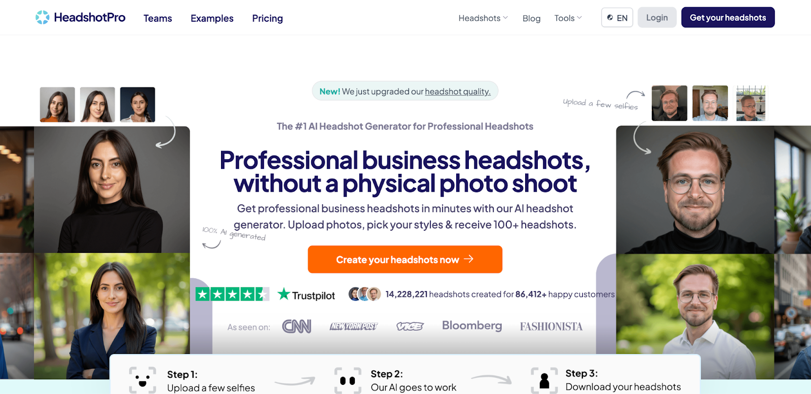
Headshot Pro is an AI-powered tool for generating professional headshots. Their landing page effectively demonstrates the product’s ease of use compared to a physical photoshoot.
What’s best in Headshot Pro landing page
- Interactive Tutorial: A tutorial bar in the hero section shows how easy it is to generate a photo, encouraging immediate engagement with the tool.
- Comprehensive Hero Section: The hero area includes value proposition, pricing, tutorial, CTAs, and reviews, providing a complete overview for visitors in a hurry.
- Product-Generated Social Proof: Reviews feature photos generated by Headshot Pro, simultaneously showcasing the tool’s capabilities and building trust.
- Comparative Advantage: By comparing their AI generator with traditional photoshoots, Headshot Pro clearly communicates its benefits and simplifies the decision process for visitors.
21. Notion
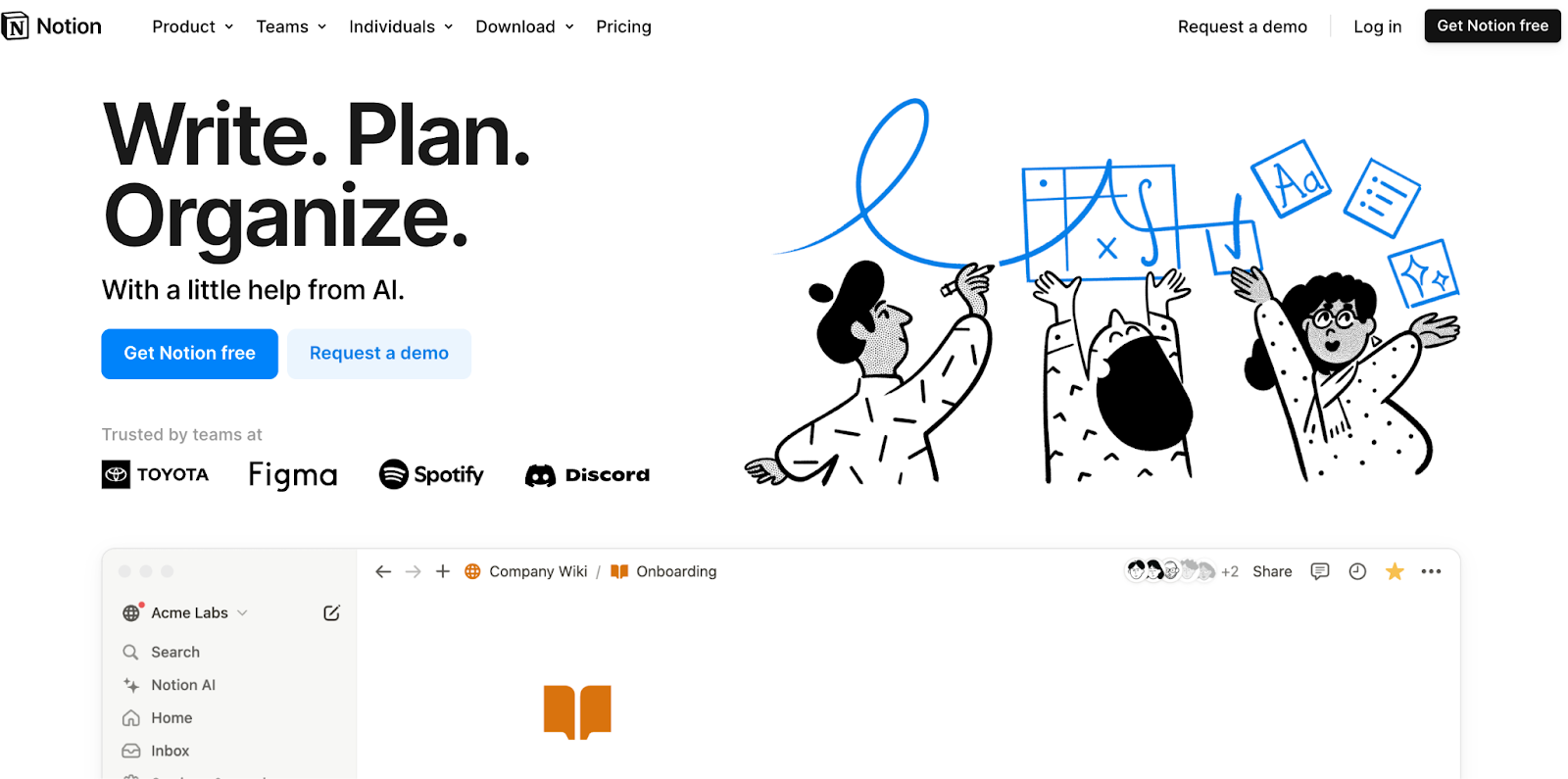
Notion is a popular all-in-one workspace tool, and has a landing page that effectively communicates its versatility and ease of use.
What’s best in Notion landing page
- Interactive Product Demo: The hero section features an interactive demo that allows visitors to explore Notion’s interface directly on the landing page.
- Use Case Showcase: Notion showcases a wide range of use cases, helping diverse visitors see how the tool can fit their specific needs.
- Community Spotlight: By highlighting community-created templates and use cases, Notion demonstrates its flexibility and strong user community.
- Seamless Integration Showcase: A section dedicated to integrations visually demonstrates how Notion works with other popular tools.
22. Ahrefs
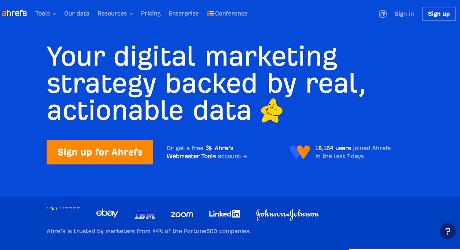
Ahrefs, a comprehensive SEO toolset, uses its landing page to showcase its powerful features, how it is superior to its competitors and showcases its industry authority.
What’s best in Ahrefs landing page
- Problem-Solution Structure: Each section clearly states a common SEO problem and how Ahrefs solves it, making the value proposition crystal clear.
- Data Visualization: Complex SEO concepts are explained through simple, engaging data visualizations and graphics.
- Feature Comparison: A detailed feature comparison with competitors highlights Ahrefs’ comprehensive offering shows how and why Ahrefs is superior.
- Learning Resources: Prominently featured free learning resources demonstrate value and build trust before purchase.
23. Canva
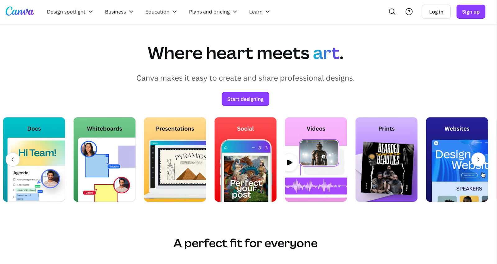
Canva is one of the biggest graphic design platforms on the internet that provides tools for creating social media graphics, presentations, promotional merchandise and Web sites.
What’s best in Canva landing page
- Dynamic Template Showcase: A constantly updating grid of designs shows the vast array of possibilities with Canva.
- Drag-and-Drop Demo: An interactive section allows visitors to try Canva’s drag-and-drop functionality directly on the landing page.
- User Stats: Impressive user statistics are prominently displayed, building credibility and showcasing widespread adoption.
- Tailored CTAs: Different CTAs for individuals, teams, and education make it easy for diverse users to find the right entry point.
24. Slack
Slack, the popular team communication tool, uses its landing page to highlight how it improves team productivity and collaboration.
What’s best in Slack landing page
- Benefit-Focused Copy: Each section focuses on a key benefit (like time savings or improved collaboration) rather than just listing features.
- Interactive Channel Demo: An interactive demo shows how Slack channels work, giving visitors a taste of the user experience.
- Industry-Specific Solutions: Dedicated sections for different industries help diverse visitors see Slack’s relevance to their specific needs.
- Customer Success Stories: Detailed case studies from well-known companies provide social proof and demonstrate real-world impact.
25. Figma
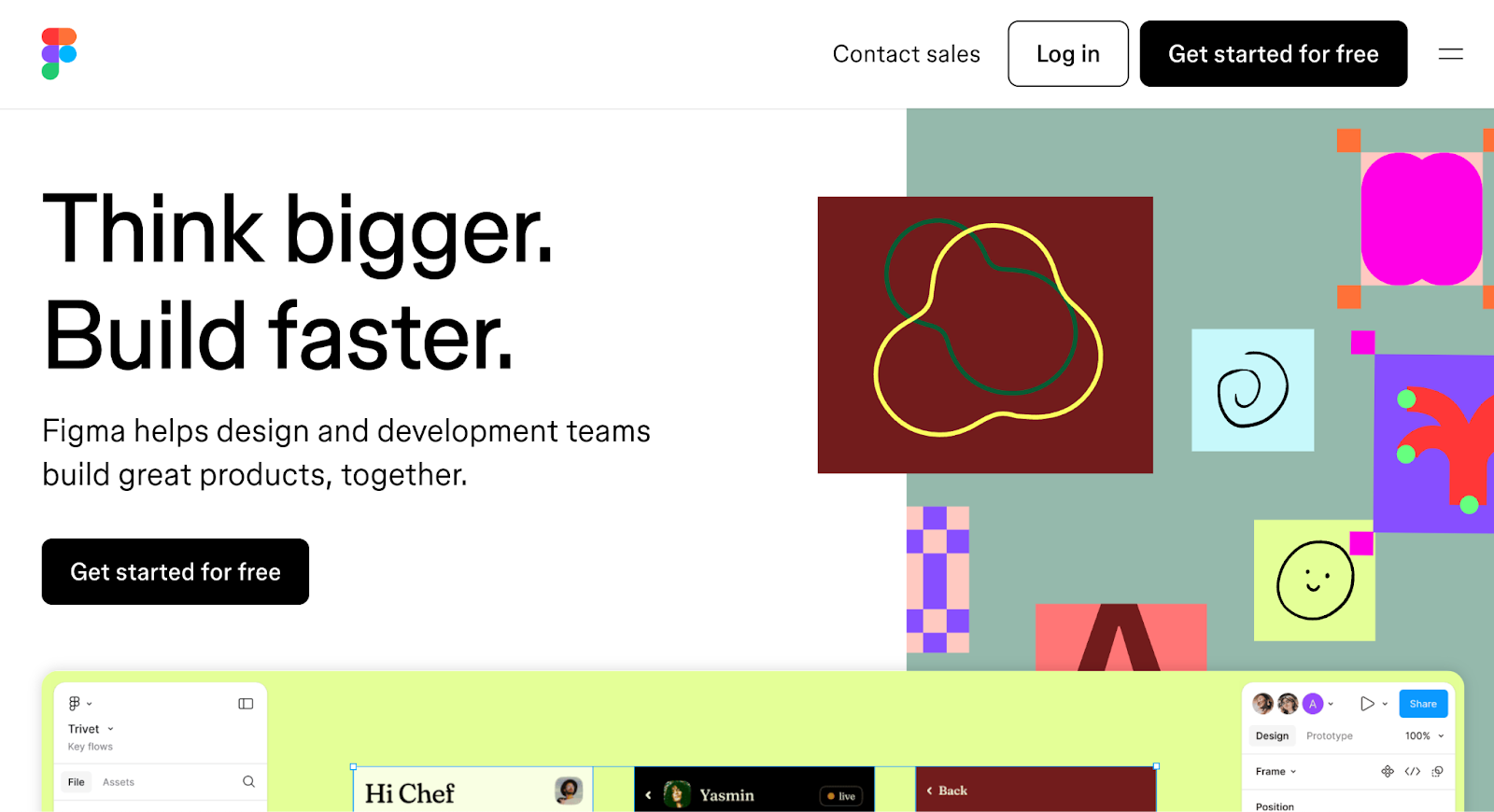
Figma is a SaaS for people to create, share, and test designs for websites, mobile apps, and other digital products and experiences
What’s best in Shopify landing page
- Live Collaboration Demo: An animated demonstration shows how multiple users can work on a design simultaneously.
- Ecosystem Showcase: A section dedicated to plugins and community resources highlights Figma’s extensibility and active user base.
- Transition Visualization: Clever animations demonstrate how Figma takes designs from concept to production seamlessly.
- Role-Based Benefits: Clear explanations of how Figma benefits different roles (designers, developers, project managers) appeal to a wide audience.
26. Loom
Loom is an online screen recording tool with advanced video editing and video storage. The SaaS has a huge user base of over 21 million.
What’s best in Loom landing page
- Instant Demo: A prominent “Record a video” button allows visitors to try Loom immediately without signing up.
- Showcase of all use cases: A diverse range of use cases are presented, from team updates to customer support, broadening appeal.
- Highlight on Integrations: Clear showcase of how Loom integrates with popular work tools, demonstrating its fit into existing workflows.
- Social Proof Variety: Mix of individual user testimonials and logos of major companies using Loom builds trust for businesses of all sizes.
What is the Average Conversion Rate on SaaS landing pages?
Before we dive into optimizing your landing page, it’s helpful to have a benchmark. So, what is a good conversion rate for a SaaS landing page?
The average conversion rate for SaaS landing pages typically falls between 3% and 5%. However, it’s important to note that this can vary widely depending on factors such as your industry, target audience, pricing, and the specific action you’re asking visitors to take.
Top-performing SaaS companies often see conversion rates of 10% or higher. But don’t be discouraged if you’re not there yet – remember, even small improvements in your conversion rate can have a significant impact on your bottom line.
It’s also worth noting that conversion rates can differ based on the source of your traffic. For example:
- Organic search traffic might convert at 2-3%
- Paid search ads might convert at 3-5%
- Referral traffic might convert at 5-8%
- Email marketing might convert at 10% or higher
Keep in mind that while these benchmarks are useful for setting goals, the most important thing is to focus on continually improving your own conversion rates over time.
9 New Trends in SaaS Landing Pages
The trends in SaaS landing pages constantly keep evolving based on changing user behaviors and preferences. Here are some current trends we’re seeing:
1. Minimalist Design: Many SaaS companies are opting for clean, uncluttered designs that focus on the essentials. This approach can prevent distracting the users with information overload and guide visitors’ attention to key elements.
2. Dark Mode: Following the broader web design trend, SaaS landing pages are offering dark mode options or even defaulting to dark color schemes.
3. Animated Illustrations: Custom animations and illustrations are being used to add personality and explain complex concepts in an engaging way.
4. Micro-Interactions: Small, subtle animations (like hover effects, and scroll animations) are being used to make pages more interactive and guide user behavior.
5. Video Backgrounds: Hero sections with looping video backgrounds are becoming more common, adding visual interest without being as resource-intensive as full-screen video.
6. Chatbots: AI-powered chatbots are increasingly being used to engage visitors, answer questions, and guide them towards conversion.
7. Mobile-First Design: With more users accessing the web via mobile devices, many SaaS companies are prioritizing mobile-friendly designs.
8. Social Proof Integration: Real-time social proof (like showing recent signups or active users) is being used to build trust and create urgency.
9. Personalization: Some landing pages use dynamic content to personalize the experience based on the visitor’s location, industry, or other data points.
Average Length of Headings on SaaS Landing Pages & Headline Ideas
On SaaS landing pages, it’s best to keep headlines short—around 6 to 12 words. This makes it easier for visitors to understand your main message quickly & keep their attention.
As for the ideas you can take with your headlines, here are some popular approaches:
1. Highlight the Problem: “Stop Wasting Time on Manual Data Entry”
2. Showcase the Benefit: “Boost Your Team’s Productivity by 50%”
3. Ask a Question: “Ready to Streamline Your Workflow?”
4. Use Social Proof: “Join 10,000+ Companies Already Saving Time with [Product]”
5. Create Urgency: “Start Saving Money Today with [Product]”
6. Focus on Ease of Use: “Simplify Your Project Management in One Click”
7. Highlight a Unique Feature: “AI-Powered Insights to Supercharge Your Sales”
8. Make a Bold Claim: “The Last CRM You’ll Ever Need”
9. Use Numbers: “3X Your Conversion Rate in 30 Days”
10. Address the Audience Directly: “Built for Marketers, by Marketers”
Remember, the best headline for your landing page will depend on your specific product, audience, and value proposition. It’s always a good idea to A/B test different headlines to see what resonates best with your visitors.
What Type of Images to Use on SaaS Landing Pages
The right images can make a huge difference in the effectiveness of your SaaS landing page. Here are some types of images that work well:
1. Product Screenshots: Show your software in action. This gives visitors a clear idea of what they’re signing up for.
2. UI Mockups: If your product isn’t built yet, high-quality mockups can work well. Just make sure they accurately represent what you’re building.
3. Custom Illustrations: These can add personality to your page and help explain complex concepts in a visually appealing way.
4. Team Photos: Real photos of your team can help build trust and give a human face to your company.
5. Customer Logos: If you have recognizable clients, displaying their logos can provide powerful social proof.
6. Icons: Simple, clean icons can help break up text and make your page more scannable.
7. Lifestyle Images: Photos showing people using your product in real-world situations can help visitors envision how it might fit into their lives.
8. Infographics: These can be great for presenting data or explaining complex processes in a visual way.
9. Animated GIFs: Short animations can demonstrate key features of your product in an engaging way.
10. Background Patterns or Textures: These can add visual interest without distracting from your main content.
When choosing images, keep these tips in mind:
- Ensure all images are high-quality and professionally designed
- Use images that align with your brand aesthetic
- Optimize images for fast loading times, Use CDN if necessary
- Include alt text for accessibility
- Consider using authentic photos rather than obviously stock images
- Ensure any people in your images represent your diverse user base
Remember, the goal of your images should be to support and enhance your messaging, not distract from it. Every image should serve a purpose in moving your visitors closer to conversion.
Tools to create a highly converting landing page
Tally (Forms): Create beautiful, customizable forms to gather information from your visitors.
LaunchList (Waitlist Management): Collect and manage signups for your product launch or beta testing.
MailerLite (Email Marketing): Sign up subscribers and nurture leads with automated email campaigns.
SocialJuice (Video Testimonials): Easily collect and showcase video testimonials to build trust.
Nudgify (Social Proof): Increase conversion rates by displaying real-time sales activity and user actions.
Crisp (Customer Support): Provide instant customer support with live chat functionality.
Hotjar (User Behavior Analysis): Use heatmaps, session recordings, and surveys to understand user behavior.
Wrapping it up
Creating an effective SaaS landing page takes a good understanding of your audience and clear communication of what you offer. Plus, you need to pay attention to design and how users experience the page.
Here are the key points we’ve covered:
- Your SaaS landing page is crucial for making a strong first impression and turning visitors into leads or customers.
- Important elements include a catchy headline, clear benefits, social proof, and a strong call-to-action.
- The average conversion rate for SaaS landing pages is 3-5%, but top ones can hit 10% or more.
- Current trends include minimalist designs, dark mode options, and animated illustrations.
- Keep headlines short (6-12 words) and focus on problems or benefits.
- Choose images that support your message, like product screenshots, custom illustrations, or lifestyle photos.
Remember, creating a highly converting landing page is a never ending process. Don’t be afraid to experiment with different elements, layouts, and messaging. Use A/B testing to continually improve your page based on data and user feedback.
Most importantly, always keep your audience at the forefront of your mind. Your landing page should speak directly to their needs, pain points, and aspirations. If you can effectively communicate how your SaaS product will make their lives easier or better, you’re well on your way to landing page success.
So, are you ready to create or optimize your SaaS landing page? With the insights and best practices we’ve discussed, you’re now equipped to create a landing page that not only looks great but also converts visitors into valuable customers. Good luck, and happy optimizing!
